Presentation/ Graphics
Another week, another DevLog!
This week we're taking a look at graphics and presentation.
Just Another Platformer currently consists of some simple graphics that will very likely change by the time the game is finished. I'm going for a pixel art type of look as I think that fits platformer games quite well.
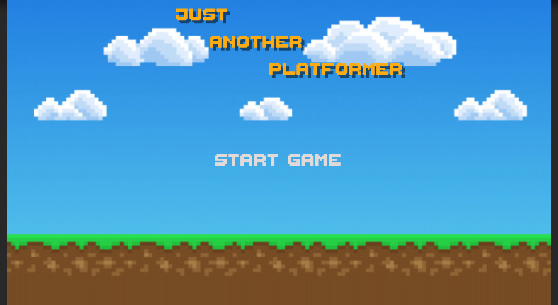
The title screen is a simple pixel are background with the games title. For the text, I used Thaleah_PixelFont from the unity asset store. Title screen:

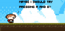
The player is currently a pixel art boy that I found on google images. This is mainly as a place holder currently until I find or make something that suits the game better. Player character:

The tilemap for the platforms works well. If I were to change it, I'd make it more pixelated.
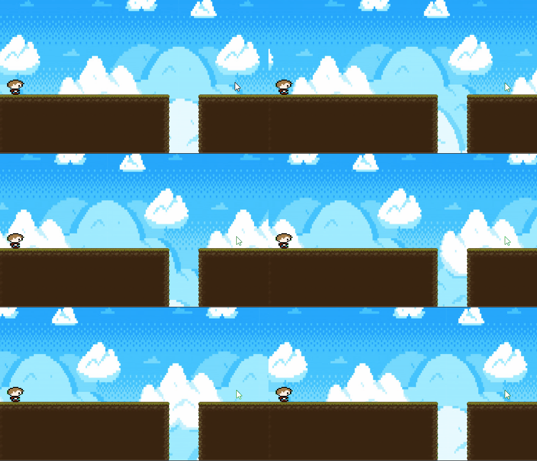
The first level currently has a scrolling background. I'm currently playing around with this and deciding whether I'll keep it or not. It's a bit 'snappy' and possibly too fast (snappiness gets worse when speed is lowered). The scrolling background is controlled by a simple script that makes use of Mathf.Repeat. Scrolling background:

I plan to add a level select and options menus to the main menu. I also want to add a death screen, or maybe a death counter.
Feedback:
- Scrolling background can be disorienting, also too fast
- Pixel size of platforms and player is too different. Player has some non-square pixels
- Buttons don't match the rest of the graphics. (these are just coloured squares that I haven't actually given proper sprites to yet)
Files
Just Another Platformer
| Status | In development |
| Author | Willza01 |
| Genre | Platformer |
More posts
- Documentatio + User GuideMay 30, 2021
- User Interface/PolishMay 24, 2021
- Basic Level BlockingApr 25, 2021
- MovementApr 19, 2021
- Just Another PlatformerApr 16, 2021
Leave a comment
Log in with itch.io to leave a comment.